Creating a Kibana dashboard means assembling Lens (or TSVB/Maps) visualizations into a single page that shares filters and a time picker. The flow is data view first, visualizations second, dashboard layout third. This guide walks the complete process on Kibana 8.x (the steps are nearly identical on OpenSearch Dashboards). A working dashboard takes 15-30 minutes once your data is indexed.
When to Use This Process (vs Alternatives)
| Goal | Use this guide | Alternative |
|---|---|---|
| Custom dashboard from your indexed data | Yes | - |
| Use a pre-built integration dashboard | No | Install the Elastic integration package (Metricbeat, Filebeat, Elastic Agent) - dashboards ship with the integration |
| Clone an existing dashboard | No | Open dashboard -> Actions -> Clone |
| Migrate from another Kibana instance | No | See Exporting Kibana Dashboard |
Prerequisites
Before starting:
- Kibana 7.10+ running and connected to Elasticsearch.
- A user account with Kibana access and read permissions on the underlying indices.
- Data already indexed in Elasticsearch with a usable timestamp field (
@timestampis the convention). - At least one data view (formerly "index pattern") configured.
Step-by-Step Guide
Step 1: Create a Data View
A data view tells Kibana which Elasticsearch indices to query and which field is the time field.
- Navigate to Stack Management -> Data Views (left-hand menu).
- Click Create data view.
- Set Name (e.g.,
logs) and Index pattern (e.g.,logs-*to match all daily log indices). - Pick the Timestamp field from the dropdown. For time-series data this should be
@timestamp. - Click Save data view to Kibana.
If the index pattern matches no indices, the data view won't save. Check that the index exists and the user has read permission on it.
Step 2: Create a Visualization with Lens
Lens is the modern, drag-and-drop visualization editor. Build each chart you want on the dashboard separately, save it, then assemble.
- Open the Dashboard page and click Create dashboard.
- Click Create visualization on the empty dashboard canvas - this opens Lens with the data view auto-selected.
- Drag a field from the field list to the workspace:
- Time field (
@timestamp) -> X-axis. - A metric field (
bytes,response_time) -> Y-axis (Lens defaults toSum,Average, orCount). - A categorical field (
service.name,host.name) -> Break down by.
- Time field (
- Lens picks a chart type (bar, line, area, pie); override via the chart-type switcher at the top right.
- Adjust the metric: click the Y-axis field to change
SumtoAverage,Median, percentiles, etc. - Click Save and return to add it to the dashboard.
Lens infers a reasonable chart from the fields you drop. The override is fast when its guess is wrong.
Step 3: Add More Panels
Repeat the visualization step for each panel. The dashboard auto-grows as you add panels.
Other panel types:
- From library: click Add from library to insert previously saved visualizations.
- Saved Discover search: useful for log-style row-by-row data.
- Markdown panel: free-form text and links - good for context, ownership, runbook pointers.
- Maps: geospatial layers.
- Controls: dropdown/range filters that users interact with at view time.
Step 4: Arrange and Resize Panels
- Resize: drag the bottom-right corner of any panel.
- Move: click the drag handle (top edge of the panel) and reposition.
- Delete: click the panel options (three-dot menu) -> Delete from dashboard.
Group related panels visually: cluster KPI metrics at the top, trend charts in the middle, drill-down tables at the bottom. Standard layout for an observability dashboard.
Step 5: Add Filters and Controls
Dashboard-level filters apply to every panel:
- Click Add filter in the toolbar.
- Choose field, operator (
is,is not,is one of,exists), and value. - Click Save.
Controls turn the dashboard into a self-service tool:
- Click Controls -> Add control.
- Select control type:
- Options list: dropdown filter on a
keywordfield (e.g.,service.name). - Range slider: numeric range filter.
- Time slider: alternative to the main time picker for slicing within the dashboard time range.
- Options list: dropdown filter on a
- Bind the control to a field and save.
Controls write into the dashboard's filter state, so they propagate to every panel that uses the bound field.
Step 6: Set the Time Range
The time picker (top-right corner) applies to every panel that uses a time field. Pick a sensible default before saving:
- Last 24 hours for general dashboards.
- Last 15 minutes for real-time ops.
- Last 7 days for trend dashboards.
Click Refresh to apply, or set an auto-refresh interval (30s, 1m, 5m) for live monitoring.
Step 7: Save the Dashboard
- Click Save in the toolbar.
- Enter a Title and optional Description.
- Check Store time with dashboard to bake in the current time range as the default.
- Optionally check Tags to label the dashboard for search.
- Click Save.
The dashboard now appears in the dashboard list and is searchable by name and tag.
Dashboard Performance: What to Watch For
A slow dashboard is almost always one of these:
- More than 15 panels firing in parallel. The slowest panel gates the whole page load.
- Wide time ranges over high-cardinality data. Aggregating 30 days of logs without filters scatters work across thousands of shards.
- Date histogram interval too granular. A 1s interval over 7 days makes 600k+ buckets.
- Saved searches returning 10k+ rows. Each load re-runs the query.
- Underperforming cluster. JVM pressure, shard imbalance, hot nodes - dashboard slowness traces back to the Elasticsearch layer.
Use the Panel Inspector (three-dot menu -> Inspect) to see the actual Elasticsearch query, request payload, and execution time. This is the fastest path from "the dashboard is slow" to "this aggregation is the bottleneck."
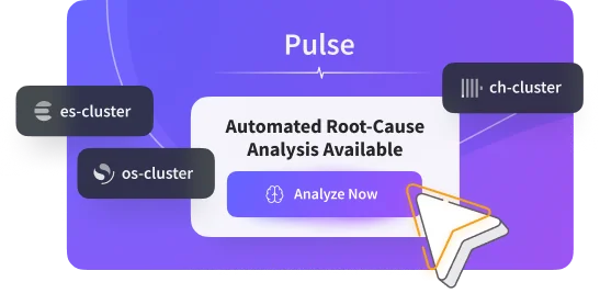
Pulse provides AI-powered monitoring for Elasticsearch and OpenSearch clusters. When a dashboard times out at the default 30 seconds (see Kibana request timeout after 30000ms), Pulse's agentic root-cause analysis traces the issue to the specific shard, node, or aggregation rather than just paging on the symptom. Connecting your cluster to proactive Pulse monitoring catches the pre-conditions (JVM pressure, shard imbalance) before dashboards slow down.
Common Pitfalls
- Too many panels. 8-12 is the practical sweet spot. Split into multiple dashboards if you need more.
- Forgetting the time picker default. Dashboards open with the last-used range otherwise.
- Saving visualizations only inside the dashboard. They become invisible in the Visualize Library. Always save reusable visualizations explicitly via "Save to library."
- Skipping Controls and forcing users to write KQL. Controls dramatically lower the bar for non-engineers.
- Not adding context. A Markdown panel with ownership and runbook links saves on-call time. Add it.
Frequently Asked Questions
Q: How do I create a Kibana dashboard from scratch?
A: Navigate to Dashboard -> Create dashboard -> Create visualization. Build each Lens chart by dragging fields, save it back to the dashboard, then add filters, controls, and time range. Save with a descriptive name.
Q: What's the difference between a Kibana visualization and a dashboard?
A: A visualization is a single chart or panel (bar chart, metric, map). A dashboard is a layout of multiple visualizations on one page sharing filters and a time range. You build visualizations, then assemble them into dashboards.
Q: How many visualizations should a Kibana dashboard have?
A: 8-12 is the practical sweet spot. Beyond 15 panels, load times become noticeable and the page becomes hard to scan. If you want more, create multiple focused dashboards and link them.
Q: Can I create a Kibana dashboard without writing code or queries?
A: Yes. Lens is fully drag-and-drop. KQL is helpful for advanced filters but not required for most dashboards. Painless scripting only enters for runtime fields and computed columns.
Q: How do I share a Kibana dashboard with my team?
A: Use the Share button to generate a shareable link, a PDF/PNG snapshot, or an iframe embed. See Exporting Kibana Dashboard for details.
Q: Why does my Kibana dashboard show "No results found"?
A: Common causes: the time picker is set to a range with no data, the data view doesn't match any indices, applied filters exclude everything, or the user lacks index-level permissions. Widen the time range first; if data appears, the issue is filtering or permissions.
Q: How do I make a Kibana dashboard auto-refresh?
A: Click the time picker, then click the calendar icon next to "Refresh every" and set an interval (e.g., 30s, 1m). Each refresh re-runs every panel's query against Elasticsearch, so don't set it tighter than you need.
Q: Can I duplicate an existing Kibana dashboard?
A: Yes. Open the dashboard, click the Actions menu, and select Clone. The clone is independent - changes don't affect the original.
Related Reading
- What is a Kibana Dashboard: concepts and components
- Examples of Useful Kibana Dashboards: real-world layouts to model from
- Exporting Kibana Dashboard: PDF, PNG, NDJSON export and sharing
- Kibana Query Language: KQL syntax for filters
- Kibana Request Timeout After 30000ms: when dashboards time out
- Kibana Data Not Showing in Dashboards: common dashboard debugging